
 Special Paper






How to Control and Solve Color Differences in Packaging Box Printing?
Color differences in printed materials can arise from multiple factors, including paper quality and ink processing techniques. Therefore, correctly understanding the relationships among these factors is crucial for controlling print color quality and preventing color discrepancies.
Paper-related causes: When purchasing paper, it's important to note that variations in brightness, smoothness, and ink absorption capacity within the same batch can all lead to color differences in printed products. If a paper reflects equal amounts of light across different spectral ranges but with low overall reflectivity, it appears grayish, reducing color saturation and making images appear dull—effectively adding a gray tone to every color. When paper selectively absorbs certain wavelengths of white light (i.e., differing reflectivity across various wavelengths), it becomes color-biased, causing significant color shifts in prints. For example, yellow-tinted paper will result in a yellowish appearance of printed colors. Before printing packaging boxes, always inspect the paper for noticeable color deviations. Papers of the same type produced by different manufacturers may vary in color and smoothness. Whenever possible, use paper from the same batch with consistent brightness, smoothness, and ink absorption properties to avoid color differences in the final print.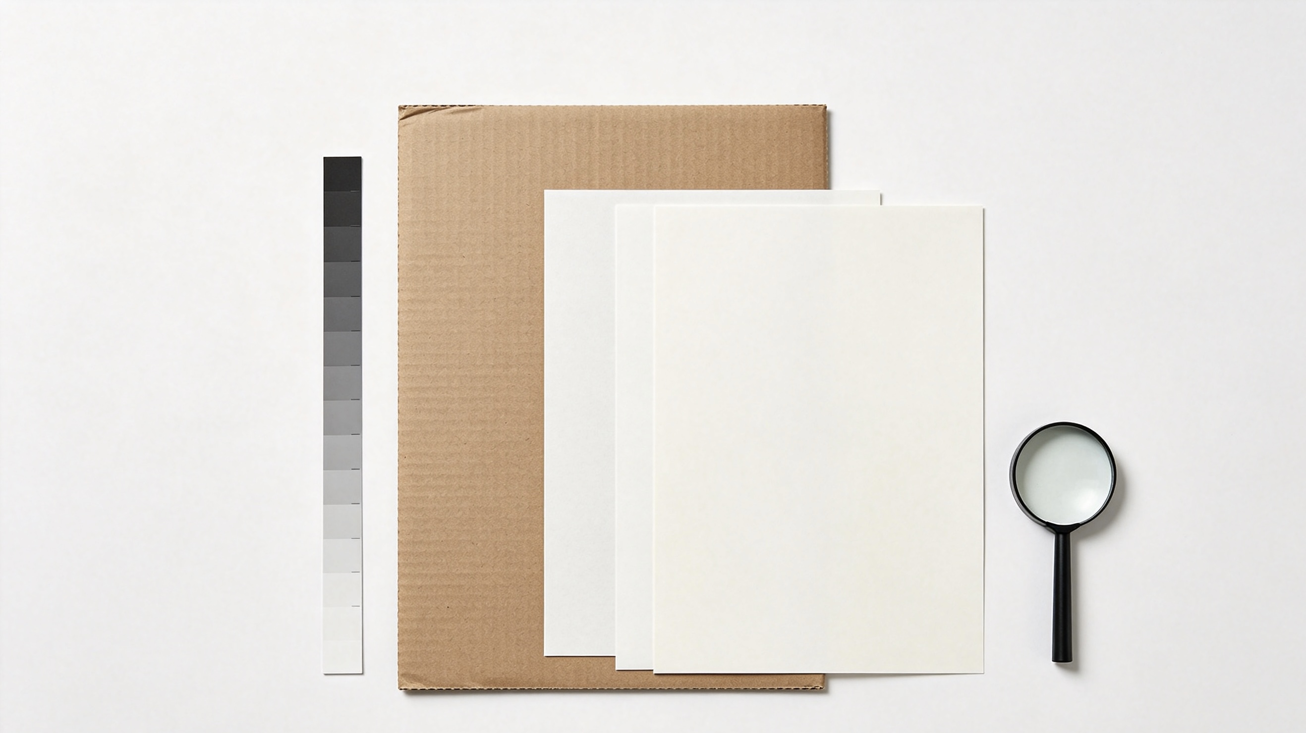
Ink-related causes: Inks from different manufacturers may have identical color tones but still produce different printed results. Variations in color between different types, brands, or applications of inks from various suppliers can also cause color differences. When mixing inks, avoid combining those with significantly different specific gravities, as this can lead to layering—where the surface layer tends toward the lighter ink and the base layer toward the heavier one. For high-quality, multi-tonal prints, especially offset lithography, inks with strong tinting strength are required to achieve clear tonal reproduction. However, for solid-color prints, where larger ink volumes are used, slightly lower tinting strength may be acceptable. If ink transparency or opacity does not meet requirements, adjustments should be made accordingly. When transparency is insufficient, add appropriate thinners or transparent oils. If opacity is inadequate, opt for more opaque inks or adjust the ink color to compensate for poor coverage, ensuring the printed color meets standards.
Therefore, printers must pay close attention to these two aspects when producing packaging boxes to prevent color discrepancies, which could lead to financial losses for the company and unnecessary additional work.